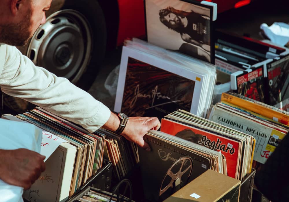
There is a lot of work that goes into creating album cover art, from carefully picking the proper font to figuring out how to represent the essence of a record’s sound with the combination of appropriate visual elements. Despite the fact that having an original and expressive album cover design is crucial, the creation process itself does not have to be difficult. In this digital age, one can resort to a platform like https://create.vista.com/create/album-cover-maker/, where all the tools are at hand to ensure the easy creation of stunning album cover art that will grab the audience’s attention and get the music heard. This guide outlines some valuable tips that may come in handy along the way.
Importance of the Album Cover
Album cover artwork is the visual gateway to the music and the image that listeners will associate with it. So first impressions are quite important when it comes to new tracks. The cover artwork of the song is likely the first thing that will catch a person’s attention before they even listen to the music. That’s especially true for the various digital music apps and platforms. If the album cover is unique and eye-catching, there is a greater chance that potential fans will turn the track on.
At the same time, cover art is an important part of music promotion and distribution. The design used to present the music is a reflection of its style. Therefore, it can be thought of as a way of branding.
Looking for Inspiration
Every musician knows how important inspiration is. Tracks don’t appear from anywhere; they need to be pulled from somewhere. One may gain inspiration for songwriting from the following simple things:
- an occasion;
- an image;
- a feeling;
- a sound;
- a piece of art, etc.
It’s possible to use the same inspiration that struck you when you were writing songs, effectively transferring the musical inspiration into images. Moreover, it’s never a bad idea to think about who you admire and get ideas from their works.

Key Elements of Designing the Cover
Several elements come into play when making an album cover, from the color choices and imagery applied on the front to the typefaces and text on the back. Separating each element will help you do things step by step rather than being overwhelmed with the entire process all at once.
#1: Color
Colors hold emotional attachments; that’s why companies use specific color options in various marketing materials, logos, or packaging. This approach applies to album covers, too. Every musician wants their audience to feel a certain way when they listen to their tracks, and the color of the cover is what can enforce that feeling. For instance, yellow and orange color options can make listeners feel playful and happy, while darker shades may set a melancholy and subdued tone for your track.
#2: Typography
The font plays the same role as colors—it can help convey your band’s personality. Here, it’s essential to think about different places for the typography placement first:
- album title;
- band name;
- tracklist on the back;
- the inner jacket.
There are several font variants that can be used for different types of music.
- Serif fonts are considered serious and traditional and pair well with classical or operatic music. Times New Roman and Cambria are typical examples.
- Sans-serif fonts, such as Helvetica and Arial, are regarded as contemporary. These fonts are a versatile choice for modern music (indie rock or electronic).
- Script fonts’ different styles can evoke a variety of feelings and thus be applied to a wide range of music types. For instance, a precise signature font style can be utilized for modern solo artists.
When making the cover, you can use a combination of fonts for different places on your album. However, refrain from using too many font types and stick to a balance. Also Read – 12 Amazing Spotify Music Visualizer
#3: Imagery
When it comes to imagery, most musicians use the band’s or primary artist’s photography. However, here almost anything is applicable, from graphics to collages or drawings.
Images of faces, along with choosing the proper colors and fonts, can be used to catch the attention of a potential listener. Faces show expressions that may reflect the listener’s emotions or mood, which can help tie into the feelings the singer expects to inspire in them.
Any graphics should be used thoughtfully, as they must be associated with the album itself. For instance, a painted landscape may go well with a mellow instrumental album.
Conclusion
Creating an eye-catching album cover is an essential part of releasing music, attracting fans, reaching new audiences, and promoting a music career. These guidelines should assist in the creation of effective covers that will help musicians stand out from the crowd.

